Austin migration insights
Posted on 02/21/2019 by Chris Ramser
- The Austin metro area’s population has grown by an average of 55,500 persons annually, or 152 per day, since 2010.
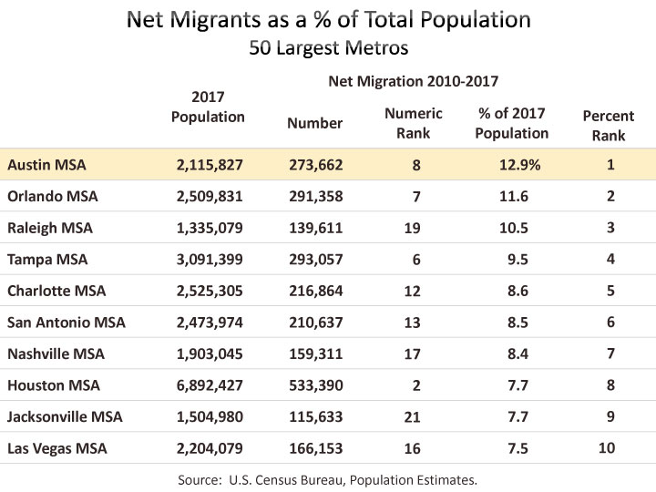
- Net migration since 2010 accounts for 12.9% of Austin’s total 2017 population—a larger share than any other top 50 metro.
- The greatest source of migrants to the Austin is other parts of Texas, followed by California, Florida, New York, and Illinois.
- The most significant metro areas making a net positive contribution to annual migration to Austin are Houston, Dallas, San Antonio, New York, and Los Angeles.
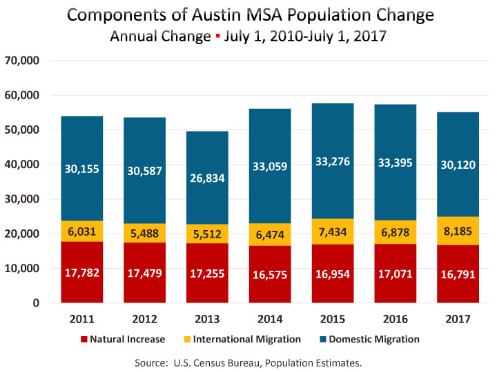
Since the beginning of the decade, the Austin MSA has grown by an average of 55,500 people annually, according to the U.S. Census Bureau’s annual Population Estimates program. In the Estimates program, growth is derived from net domestic migration, net international migration, and natural increase (births minus deaths). The majority, 56.2%, of Austin’s growth since 2010 is attributable to net domestic migration. Net international migration accounts for another 12.3% of total change, and 30.4% is due to natural increase. From 2010 to 2017, Austin received an annual average net gain of 31,300 people annually from other locations in the U.S., 6,900 from abroad, and 16,700 from natural increase.
The balance between growth attributable to net migration and to natural increase varies widely among major metros. Among the ten fastest growing metros, net migration dominates, but ranges from 55% to 78% of total growth. For Austin, which was the fastest growing metro between 2010 and 2017, net migration accounts for 68% of total growth. Between 2010 and 2017, Austin added 273,662 net new migrants, which represents 12.9% of Austin’s total 2017 population. That share is larger than in any of the other 50 largest metros. Orlando came in second with 11.6% and Raleigh was third with 10.5% of their current population attributable to net migration since 2010.
While domestic migration represents the majority (82%) of net migration for Austin, some regions rely mostly on international migration, including coastal metros like Miami, San Jose, New York, Washington, Boston, San Francisco. Some of these would have negative migration but for the infusion of international migrants. Net international migration since 2010 accounts for 2.3% of Austin’s 2017 population. That share ranks 17th among the 50 largest metros. Houston’s share is 3.8%, the highest among Texas’ major metros. Last year net international migration to Austin was higher than the previous six years since 2010, up 19% from 6,878 in 2016 to 8,185 in 2017.

In contrast to Austin, Texas sees a greater percentage of growth attributed to natural increase (change due to births and deaths) than to net migration. For Texas as a whole, population change from 2016 to 2017 broke down as 52.4% from natural increase and 47.4% from net migration. Austin’s growth in 2017 was 30.4% natural increase and 69.3% net migration.

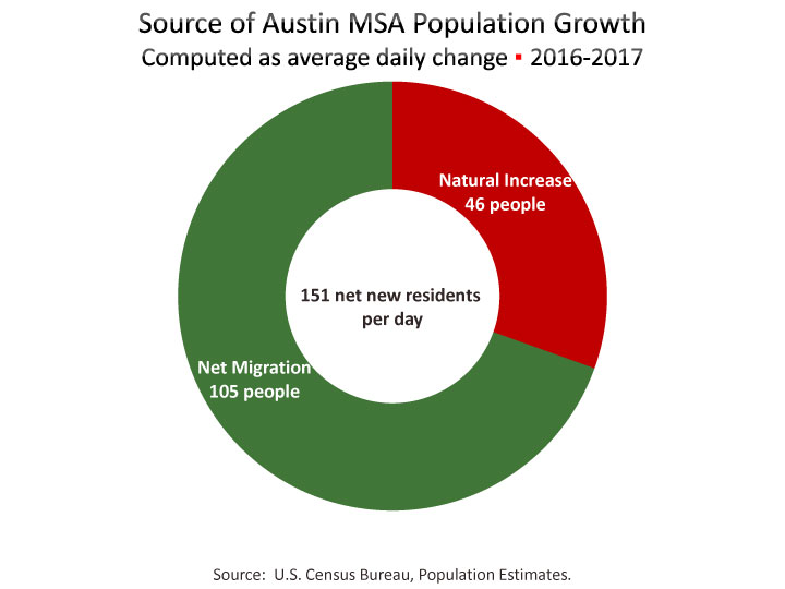
Austin’s population growth from 2016 to 2017 was 55,269, which is an average daily increase of 151 new residents. On a daily average basis, net migration represents 105 persons per day, while another 46 persons are the result of births exceeding deaths.[1] New county and metro area population estimates (and components of change) through 2018 will be released in April 2019.
Geographic Mobility
An alternative perspective on migration is provided in the Census Bureau’s American Community Survey (ACS). For most U.S. metropolitan areas, the ACS provides annual estimates of a large array of population and housing characteristics based on a sample survey of households. The survey addresses mobility, or migration, in the form of questions about where people lived one year earlier. Of Austin’s 2.1 million population over one year of age in 2017, 1.7 million live in the same house and the balance moved within the year. Of the 382,016 people who lived in a different house a year earlier, 237,566 lived someplace else within the Austin metro, and 144,450 lived in a different part of the U.S. or abroad.[2] Thus, residents who moved to Austin from someplace else within the last year represent 6.9% of the metro’s 2017 population. That rate is the highest share among the top 50 metros.
Austin Migration by State Origin/Destination
Estimates of migrants in and out of and area by places of origin and destination is a relatively new set of estimates derived from the ACS and introduced by the Census Bureau seven or eight years ago.
Using sample data collected each year, the Census Bureau aggregates five years of ACS data to generate estimates of annual migration between each U.S. county, and publishes this data in its Census Flows Mapper application.[3] The current version of the map uses samples collected from 2012 to 2016, but the data is produced to represent annual estimates of movers between counties. Customarily, each edition of this data includes detail for a selected aspect of mover demographics—age, sex, and race/ethnicity was featured in the 2011-2015 release; while earlier releases treated household type and housing tenure; ability to speak English and place of birth; employment status and occupation; or education and income. However, the 2012-2016 dataset does not provide a comparable option.
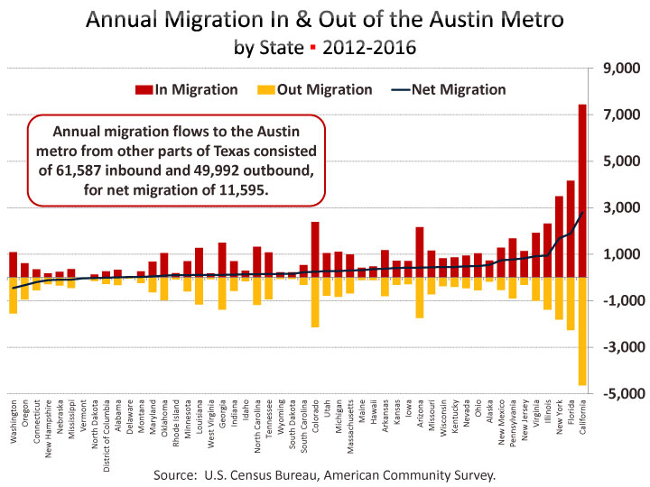
Data downloaded from Census Flows Mapper shows the number of net migrants as well as inbound and outbound flows from a selected county to all other counties in the U.S. and Puerto Rico. Using the metro area aggregated tables, the Austin region received 115,696 domestic inbound migrants,[4], and sent 86,798 outbound migrants to other places, resulting in net migration of 28,898. Inbound flow was dominated by people arriving from other counties in Texas (53.2%), followed by California (6.4%), Florida (3.6%), New York (3.0%), and Colorado (2.1%). Each state that contributed at least 1.0% of inbound migrants to Austin MSA are labeled in the pie chart below. All other states contributed 16.0% of the inbound total.

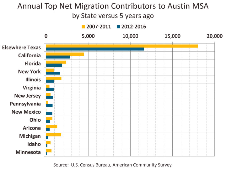
In-migration to the Austin region exceeded out-migration for 42 states, while Austin saw slight deficit flows with eight states and the District of Columbia—that is more Austinites departing to, than coming from these states. Three states, excluding Texas (with 11,595), contributed over 1,000 net migrants each to Austin, including California (2,798), Florida (1,895), and New York (1,682), with another six states contributing over 500 net migrants a year Illinois (943), Virginia (916), New Jersey (825), Pennsylvania (776), New Mexico (740), and Alaska (541). The nine states with negative net migration to Austin were Washington (-455), Oregon, (-327), Connecticut, (-198), New Hampshire (-113), Nebraska (-92), Mississippi (-90), Vermont (-34), North Dakota, (-23), and District of Columbia (-8).[5]
Net migration to the Austin region, while generally robust, has varied over time depending on the economic conditions throughout the country. Five years ago (data collected from 2007-2011—the period just before and including the Great Recession), Austin saw an annual net migration from U.S. states at around 37,400 compared to 29,000 from the most recent release of data from 2012-2016. The top origin states for positive net migration five years ago were elsewhere in Texas, California, Florida, Illinois, Michigan and Arizona. Now, the states contributing the most gain to Austin still includes elsewhere in Texas, California, and Florida, while New York, Illinois and Virginia rounding out the top five. The graph below shows how the top states contributing migrants to Austin has changed between the current period and the previous.
Austin Migration by Metro Origin/Destination
We’ve also analyzed the migration flows between Austin and other metropolitan areas and produced two tables of the 20 largest positive and deficit flows. Of the top 20 positive net flows to Austin, seven were from other Texas metros. Topping the list was Houston with a net 4,557 people to Austin each year over the past five years, followed by Dallas with 2,408, and San Antonio with 1,883. Rounding out the top five were New York (1,484) and Los Angeles (1,292). Two other California metros (San Francisco and Riverside), and two Florida metros (Tampa and Miami) were also in the Top 20.

The top 20 metro areas with which Austin has a migration deficit included five Texas metros: College Station, Longview, Beaumont, Corpus Christi, and Odessa. College Station was at the top of this list with an estimated annual inbound flow of 1,707 compared to outbound flow of 2,045 resulting in a net deficit of 338. Rounding out the top five were Seattle, Hartford, Longview, and Nashville.[6]

Other metros with a large volume of inbound and outbound migrants but that were not on the lists of the top 20 net positive and deficit flows, were Killeen (inbound 3,248, outbound 3,101), Phoenix (inbound 1,415, outbound 1,197), Waco (inbound 1,234, outbound 1,143), Lubbock (inbound 1,046, outbound 837), San Jose (inbound 841, outbound 745), Boston (inbound 853, outbound 560), and San Diego (inbound 793, outbound 580).
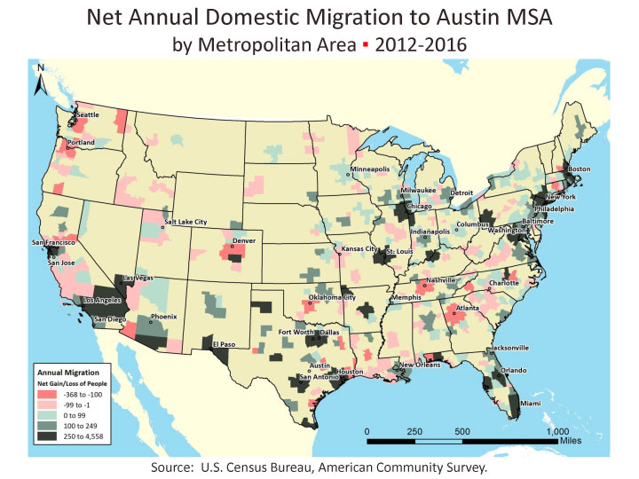
The map below illustrates net annual migration to Austin for all metros. Areas of red indicate metros with a deficit flow for Austin while the darker greens are the biggest net migrant contributors.
Migration between Austin Metro Counties
Analyzing migration between counties within the Austin area is also a possible use of this data. An annual estimate of 50,956 people moved from one county in the metro to another. The below crosswalk table allows for looking up the total number of estimated movers from one county to another in the metro area. Start by picking a county from the vertical list of counties labeled “moved out of” and next pick a county from the list of horizontal list of “moved into” counties, finding the cell where the row and column intersection. For example, 18,205 moved out of Travis and into Williamson. Conversely, 11,146 moved out of Williamson and into Travis.

An alternative to the Census Bureau’s county-to-county migration data, comes from the Internal Revenue Service. The IRS publishes a dataset based on year-to-year address changes reported on individual income tax returns. The most recently available dataset is for 2015-16.
To download an Excel workbook of several worksheets of the data presented in this article, click here. The file includes a summary table of county, metro, and flows for the Austin MSA region as well as an individual worksheet of county-to-county flows for each of the five Austin MSA counties.
FOOTNOTES:
[1] Population change also includes a residual component that is not attributable to demographic shifts. The residual component is the result of population controls applied to lower levels of geography or due to incorporation of accepted challenges and special censuses into the population estimates. Sometimes the residual component is sizable enough to be noticeable, however, the residual growth for the Austin MSA from 2016-2017 was only 173.
[2] This Excel file contains the 2017 ACS Geographic Mobility table for all Metropolitan Areas as well as the Austin ranking showing Austin with the highest concentration of residents who migrated to the region in the past year.
[3] Metro-to-metro migration flows are also downloadable in Excel from this Migration/Geographic Mobility page.
[4] These calculations exclude migration to/from Puerto Rico.
[5] Note that estimates are collected from a sample survey. It is possible that some of the states with smaller net migration totals could be within the margin of error for these estimates, meaning it is not definitively established that the state’s net migration was actually a deficit or positive flow.
[6] Perhaps underscoring some of the limitations of the data as a result of sample size and potential margins of error is the possible, but curious 0 inbound migration from Medford, OR while a supposed 107 people were estimated to have left Austin to that small metro of 200,000. When dealing with the type of sample data like the ACS, it is not uncommon to have margins of error in the hundreds range, and upon further examination of the net migration for Austin and Medford, OR, the margin of error was 115, which essentially means the supposed deficit may not actually exist.
Related Categories: Central Texas Economy in Perspective