Austin Migration Insights
Sign up for the Central Texas Economy Report newsletter
Posted on 02/08/2022 by Chris Ramser
- The Austin metro area gains about 33,700 people annually from domestic migration, 6,660 from international migration, and 15,980 from natural increase.
- Austin ranks first among the top 50 largest metros for new residents as a percent of total population.
- The greatest source of new migrants to the Austin metro is other parts of Texas, although the average annual number of new residents from elsewhere in Texas has decreased and the number from California and New York has increased over the last five years.
- The most significant metro area net contributors to Austin MSA’s annual growth are Houston, Dallas, San Antonio, Los Angeles, and New York.
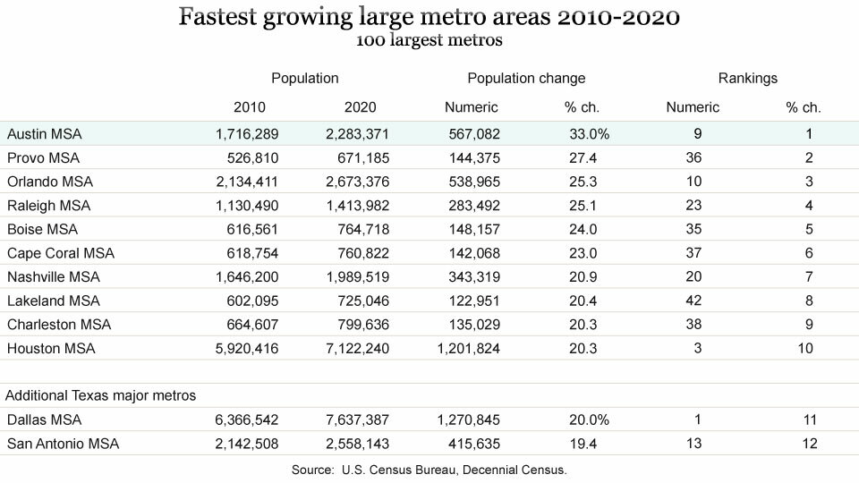
According to the U.S. Census Bureau’s decennial census 2020, the Austin metro was the fastest growing of the top 100 U.S. metros from 2010 to 2020, adding 567,082 people and growing at a rate of 33.0%. The Chamber previously published an article covering highlights of that data. The decennial counts do not cover the components of population growth and the origins of new residents to Austin. Two other Census Bureau datasets address migration and those recent releases are the focus of what follows.
Population estimates & net migration
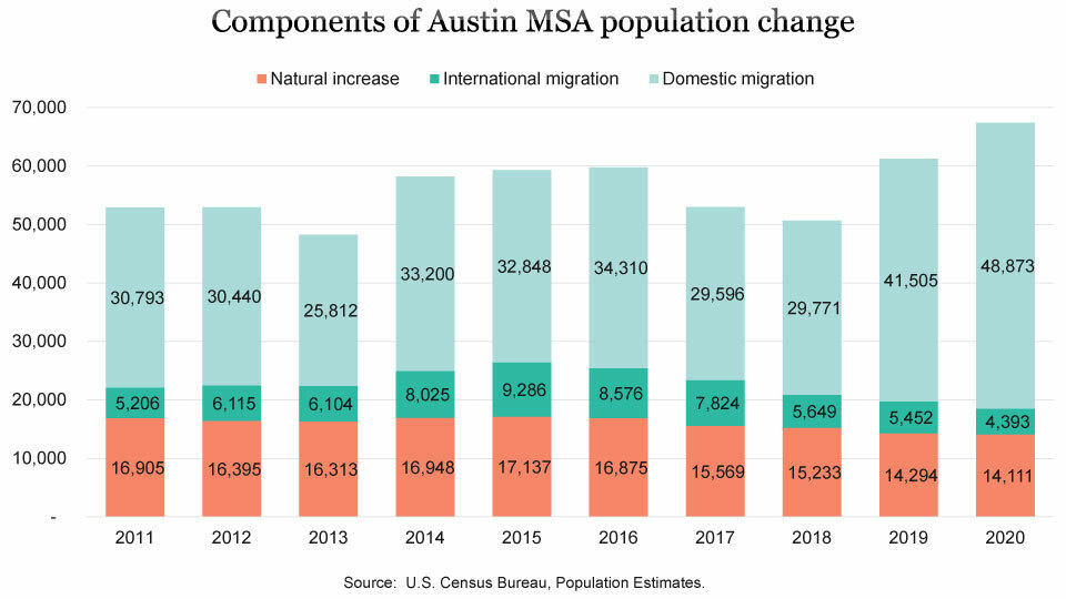
Since the beginning of the decade, the Austin MSA has grown by an average of 56,800 people annually, according to the U.S. Census Bureau’s population estimates program. Much of this growth is attributable to net domestic migration, roughly 59.4%, with another 11.7% due to net international migration, and 28.1% from natural increase. Domestic migration in the last two years of the decade increased dramatically to 41,505 in 2019 and 48,873 in 2020, far surpassing the decade average of 33,714 people annually.
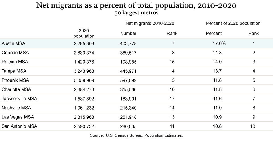
Austin ranks first among the top 50 largest metros for new residents as a percent of total population. Between 2010 and 2020, Austin added 403,778 net new migrants, or 17.6% of our total 2020 population. Orlando came in second with 14.8% and Raleigh was third with 14.0% of their current population attributed to net migration. San Antonio also made the top 10 with net migration since 2010 accounting for 10.8% of the metro’s total population. Dallas and Houston rank 11th and 14th with 9.8% and 8.8%, respectively. Across all U.S. metros, net migration since 2010 accounts for 3.1% of 2020 population.
While domestic migration is the predominate share of migration between 2010 and 2020 for Austin, some metros rely mostly on international migration including Miami, San Jose, San Francisco, Boston, and Washington. Several of these metros would have negative migration but for the infusion of international migrants. Among the 50 largest metros, Austin ranked 16thfor net international migration as a percent of total population.

Texas’ growth is nearly evenly divided between natural increase (births minus deaths) and net migration. Texas’ population change from 2019 to 2020 was more evenly attributed to natural increase, 42%, and net migration, 58%, than Austin’s growth which was 21% from natural increase and 79% from net migration.
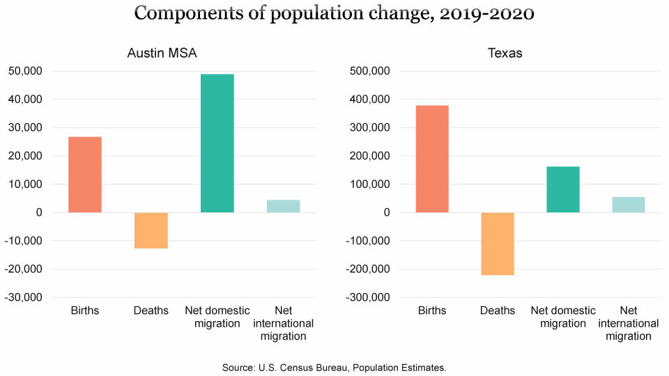
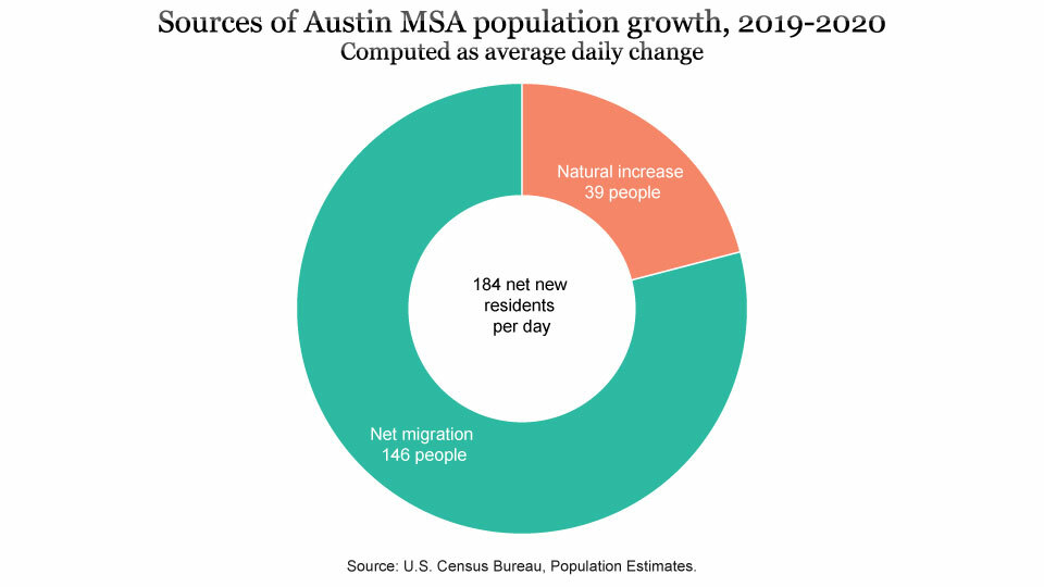
The region’s annual growth from 2019 to 2020, as calculated from the Census Bureau’s population estimates, was 67,197 or 184 persons per day. Of this daily number, net migration accounts for 146, and 39 are the result of births exceeding deaths.[1]
Geographic mobility
Additional insights into migration are provided by the Census Bureau’s American Community Survey (ACS). This annual sample survey, the replacement for the Decennial Census’s “long form” questionnaire, instituted following the 2000 Census, provides data on many demographic, economic, social, and housing characteristics of U.S. residents.
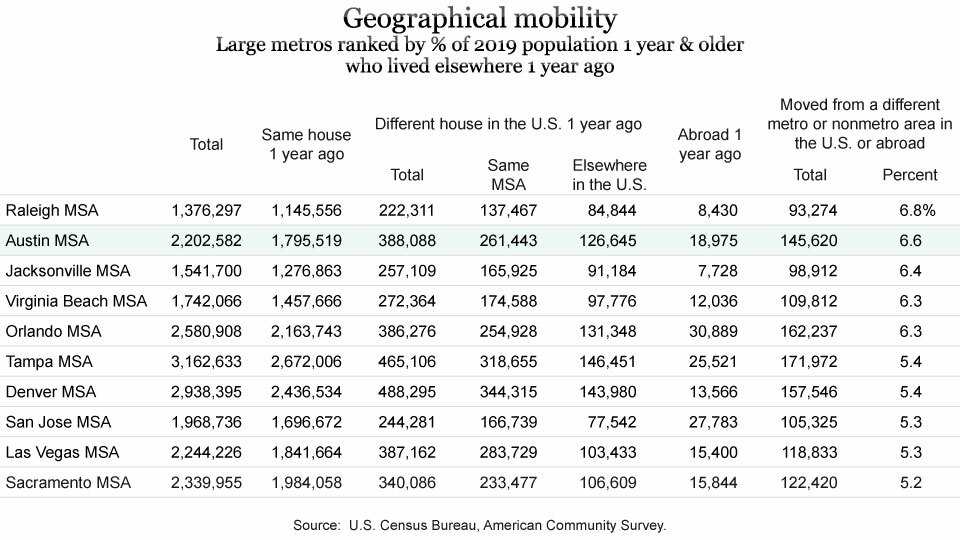
The ACS asks respondents questions about where they lived a year earlier. Of Austin’s 2,202,582 residents one year of age and older in 2019, 145,620 lived somewhere other than in the Austin MSA the year before. That’s 6.6% of Austin’s population and, among major metros, Austin ranks second for “movers in” as a percent of total population.
Origin of migrants
The ACS also provides detail on where people move from and move to. Using sample data collected each year, the Census Bureau aggregates five years of ACS data to generate estimates of annual migration between each U.S. county and publishes this data in its Census Flows Mapper application.[2] The current version of the map uses samples collected from 2015 to 2019 and estimates represent the annual number of movers during this period.
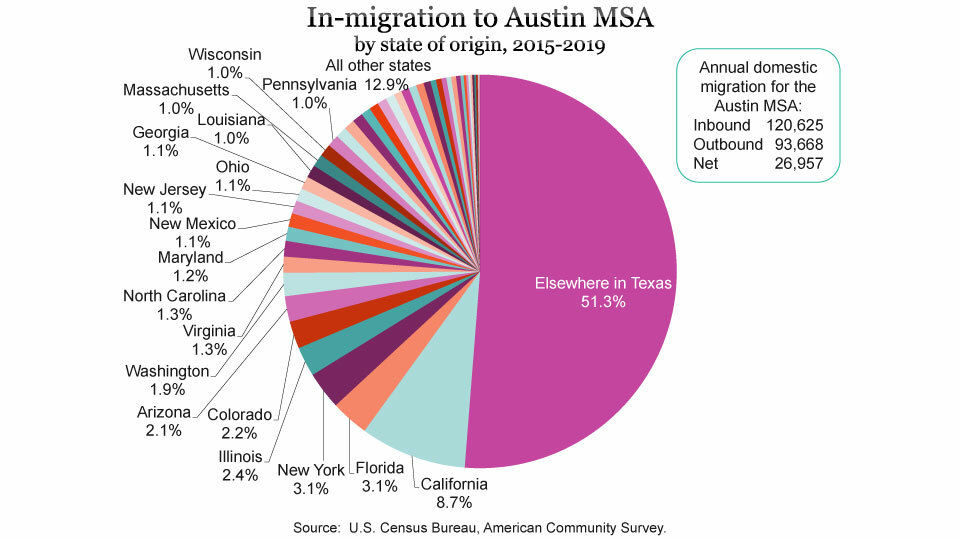
Data downloaded from Census Flows Mapper shows inbound and outbound flows, as well as net migrants, from a selected county to all other counties in the U.S. and Puerto Rico. Using the metro area aggregated tables, the Austin region received 120,625 domestic inbound migrants,[3] and sent 93,668 outbound migrants to other places, resulting in net migration of 26,957. Inbound flow was dominated by people arriving from other counties in Texas (51.3%), followed by California (8.7%), Florida (3.1%), New York (3.1%), and Illinois (2.4%). Each state that contributed at least 1.0% of inbound migrants to Austin MSA are labeled in the pie chart below. All other states contributed 12.9% of the inbound total.
In-migration to the Austin region exceeded out-migration for 31 states, while Austin saw slight deficit flows with 20 states and the District of Columbia—that is, more Austinites departing to than coming from these states. Three states, excluding Texas with 10,476[4], contributed over 1,000 net migrants each year to Austin, including California (5,951), New York (1,887), and Illinois (1,517) with another eight states contributing over 500 net migrants a year (New Mexico, 893; Ohio, 744; New Jersey, 730; Wisconsin, 688; Florida, 657; Maryland, 602; Minnesota, 563; and Massachusetts, 529. The states that gained the most residents from Austin were Nevada (-314), Connecticut (-292), Oregon (-291), Oklahoma (-263), and Washington, DC (-245). Since the information for this release is collected through a sample survey, it is possible that some of the states with smaller net migration totals could be within the margin of error for these estimates, meaning it is impossible to tell if the state’s net migration was actually a deficit or positive flow.
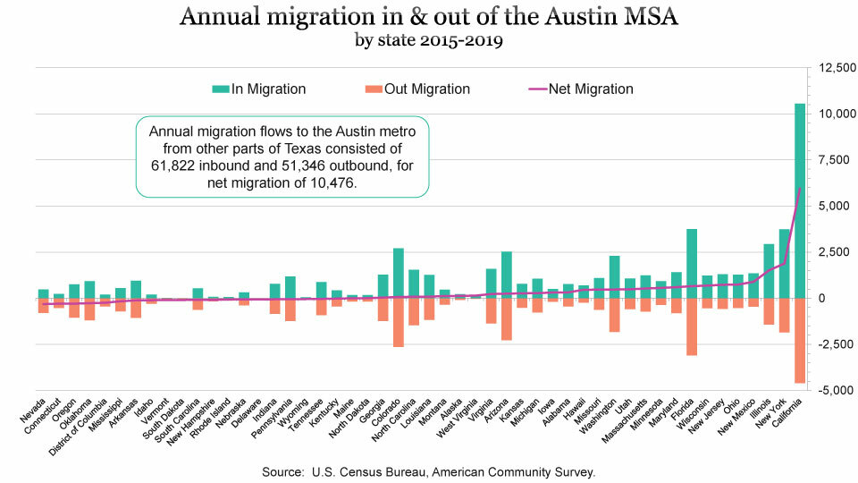
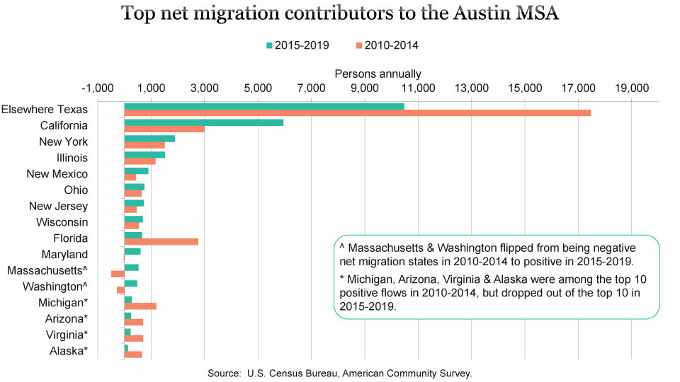
Net migration to the Austin region, while generally robust, has varied somewhat through the years depending on the economic conditions throughout the country. Five years ago (data collected from 2010-2014—just after the Great Recession), Austin saw an annual net migration from U.S. states at around 36,693, compared to 26,957 from the most recent release of data from 2015-2019. Three of the top five states five years ago—elsewhere in Texas, California, and New York—are still in the top five in 2019. Illinois and New Mexico have replaced Florida and Michigan in the top five.
Another major difference between the two periods is the scale of migration from several states has increased, particularly from California, which is now sending an average 3,000 more migrants to Austin. Just as migration to Austin has picked up in some places, it has decreased dramatically in others especially from elsewhere in Texas (down by nearly 7,000) and from Florida (2,100). Two states had notably negative flows in 2010-2014, but are now positive: Massachusetts flipped from -495 in 2010-2014 to 529 in 2015-2019, and Washington down -279 is now up 477.
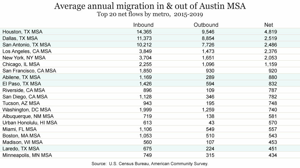
In addition to examining flows into/out of the Austin metro by state, we’ve analyzed the migration flows between Austin and other metropolitan areas and produced two tables of the 20 largest positive and deficit flows. Of the top 20 net flows to Austin, six were from fellow metro areas in Texas and four were in California. Topping the list was Houston with a net 4,819 people to Austin each year over the past five years, followed by Dallas with 2,519, and San Antonio with 2,486. Rounding out the top five were Los Angeles (2,376) and New York (2,053). The three other California metros in the top 20 were San Francisco, 920; Riverside, 787; and San Diego, 782.
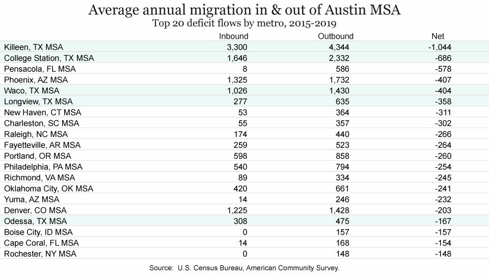
The top 20 metro areas with which Austin has a migration deficit included five Texas metros: Killeen, College Station, Waco, Longview, and Odessa. Killeen was at the top of this list with an estimated annual inbound flow of 3,300 compared to outbound flow of 4,344 resulting in a net deficit of 1,044, while College Station’s net deficit was 686. Rounding out the top five were Pensacola, FL at -578, Phoenix at -407, and Waco at -404.[5] Counties in the U.S. that are not classified within a metro area gained an average net of 1,073 people each year from the Austin MSA over the past five years.
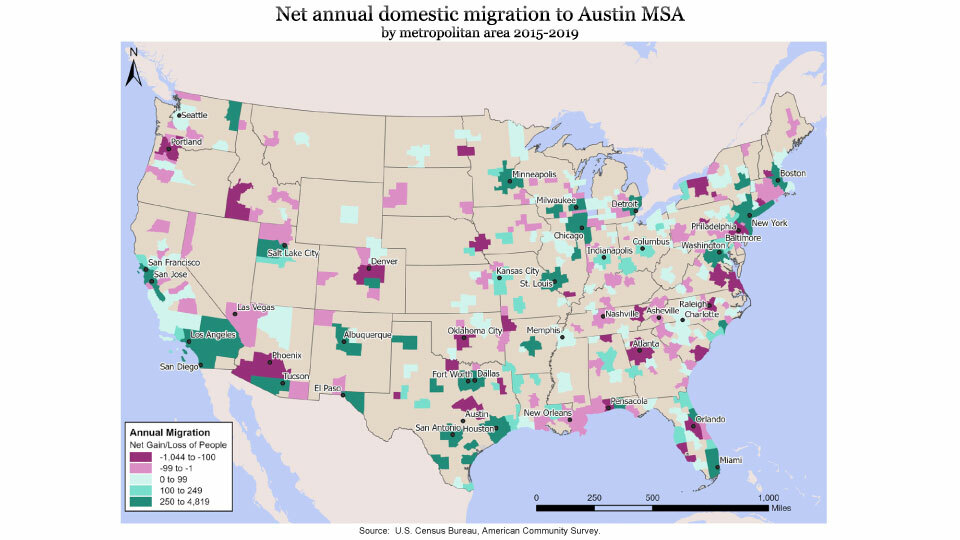
Other metros with a large volume of in and outbound migrants, but not among the top 20 net positive and deficit flows, were Corpus Christi (1,600 inbound, 1,180 outbound), Seattle (1,366 inbound, 1,293 outbound), San Jose (1,240 inbound, 883 outbound), McAllen (1,071 inbound, 1,038 outbound), Lubbock (967 inbound, 876 outbound), Atlanta (776 inbound, 899 outbound), and Brownsville (838 inbound, 659 outbound). Below is a choropleth map of the net annual migration to Austin for all metros. Areas in purple indicate metros with a deficit flow for Austin while the darker greens are the biggest net migrant contributors.
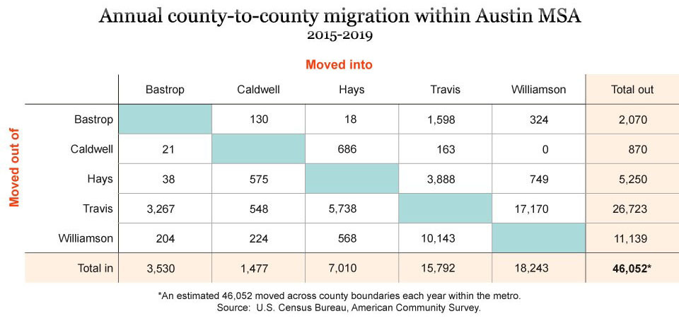
Analyzing migration between counties within the Austin area is also a possible use of this data. An annual estimate of 46,052 people moved from one county in the Austin metro to another. The below crosswalk table allows for looking up the total number of estimated movers from one metro county to another in the metro area. Start by picking a county from the vertical list of counties labeled “moved out of” and next pick a county from the horizontal list of “moved into” counties, finding the cell where the row and column intersection. For example, 17,170 moved out of Travis and into Williamson. Conversely, 10,143 moved out of Williamson and into Travis.
To download an Excel workbook of several worksheets of the data presented in this article, click here. The file includes a summary table of county, metro, and flows for the Austin MSA region as well as an individual worksheet of county-to-county flows for each of the five Austin MSA counties.
Additional migration data sources
The Internal Revenue Service (IRS) periodically publishes a dataset of U.S. migration data based on year-to-year address changes reported on individual income tax returns. The most recently available dataset is for 2018-19.
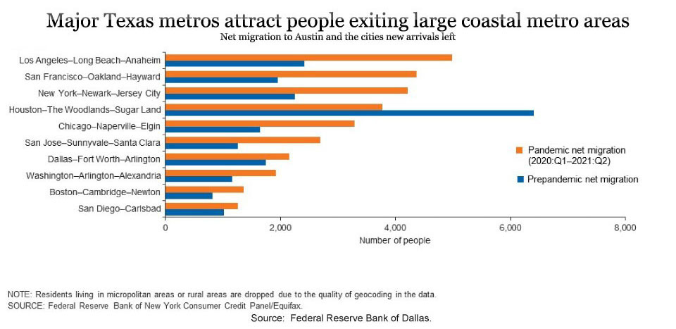
The Federal Reserve Bank of Dallas analyzed Texas metro migration trends in the five quarters just before the pandemic and the five quarters during the pandemic (2020Q1 to 2021 Q2) using high-frequency credit-bureau address changes in this recent article. The analysis found that migration to Texas sped up from already-high levels during the pandemic with 174,000 net new migrants moving to Texas in the five pandemic quarters compared to 109,000 in the five previous prepandemic quarters. The article found that much of the migration was from large coastal metros. Below is a portion of Chart 3 published within that article showing the top net origins for new Austin metro residents.
The U.S. Postal Service also publishes data files of number of requests received for change of address forms to and from each U.S. zip code. Available on their library page, the USPS has data for 2018 through 2021. Although this source doesn’t include information about the origin zip code, it does represent the scale of net migration for zip codes.
FOOTNOTES:
- Population change also includes a residual component that is not attributable to demographic shifts. The residual component is the result of population controls applied to lower levels of geography or due to incorporation of accepted challenges and special censuses into the population estimates. Sometimes the residual component is sizable enough to be noticeable, resulting in the individual components of change not equaling the total population change. In this case, the residual component for the Austin MSA from 2019-2020 was -180. ↩
- Metropolitan area flows are also downloadable in excel from this site. ↩
- These calculations exclude migration to/from Puerto Rico.↩
- The Texas total here represents the non Metro Austin portion of the State, labeled as “elsewhere Texas” in the graphs. ↩
Perhaps underscoring some of the limitations of the data as a result of sample size and potential margins of error is the possible, but curious, 0 inbound migration from Boise City, ID, while 157 people were estimated to have moved from Austin to that mid-sized metro of 750,000. When dealing with sample survey data like the ACS, it is not uncommon to have margins of error in the hundreds range, and upon further examination of the net migration for Austin and Boise, ID, the margin of error was 110, which essentially means the deficit may be anywhere between 47 and 267.↩
Related Categories: Central Texas Economy in Perspective